Jan 24, 2018

10 Free Customizable CSS Snippets for Radio Toggles & Switches

Radio buttons have only recently been open for deep customizations with CSS. The on/off switch design was lifted from Apple’s original iOS and moved onto the web using radios and checkboxes for toggle switches.
1. Accessible Toggles
Accessibility is a huge concern on the web and it’s something you have to consider when restyling an HTML element. These accessible toggles by Chris Hart show just how much you can change with a little CSS.
Each switch has its own unique style including custom animation effects. You can click either side of the switch to toggle the result which is perfect for usability on smaller screens.
Overall these switches are some of the best you can use and they’re really easy to customize. However they do rely on checkboxes so form submissions work a bit differently compared to radio buttons.

2. On/Off CSS Switches

If you like a minimalist approach to design then check out these radios created by Nick Bottomley. They’re as simple as can be and they work flawlessly.
The secondary styles even add custom animation effects to the switch where it expands out like a blob before animating. You can add optional labels that light up when switched on/off and you have plenty of room for adding colors and changing styles.
I’d say these switches make the sturdiest base for customizing on/off buttons without building them from scratch.

3. iOS7 Switches

When Apple released iOS 7 it came with many updates including a flatter design and new on/off switches. These iOS7 switches were recreated using checkboxes and CSS3 by skilled developer Bandar Raffah.
The backgrounds have an interesting animation effect where they slide in & out of view along with the switch button. It’s a really unique approach to the design and the fact that it’s all powered by CSS is even more impressive.
If you’re looking for an Apple-inspired design on your site then these checkbox switches take the cake.

4. Pure CSS Circles

For a slightly more customized solution take a look at these iOS switches by Jesse Couch. The labels are built primarily for Chrome and Firefox so they may not work in all browsers like Opera or Safari.
But they do support the “label” element for radios that can automatically switch between values when clicked. This way the user doesn’t even need to hit the radio, but just the label to get the on/off switch working.

5. Win10 Switches

Windows 10 users will know all about their latest changes for better or worse. The new Win10 settings include many custom on/off switches duplicated in this pen.
You can edit the size, color, and padding all through SCSS variables right in CodePen. These switches all use the HTML checkbox element which makes them superior for mobile users. They don’t have much animation but they look great and work well, two factors that always sell quality interface elements.

6. Clean On/Off Toggle

For accessibility you have to consider how checkboxes handle in older browsers and how attributes like aria-hidden operate. That’s the basis of this pen created by Felipe Fialho.
He takes this on/off switch to the highest level of support with an HTML label and custom styles that degrade gracefully. It’s also a nice looking switch and given the simple setup it works well on any website.

7. Switchboxes

These cleverly designed switchbox inputs were created by Victor Knust as a universally-supported solution. Every switch works in all major browsers including IE7 and above.
Because of this wide browser support you will have to work with JavaScript. It’s not much JavaScript, but it is a factor when deciding if these switches could work on your site.
But they look great and offer universal support which is more than most CSS-based switches.

8. Custom Square Toggles

If you’re really going for custom then check out these square toggles by Andrew Gehman. They completely restyle the checkbox design with square corners, a square switch, and custom text.
I can’t imagine this would blend nicely into many websites. However it shows how far you can go with pure CSS3 and this may be a nice codebase to start with if you wanna customize your own checkboxes.

9. Glowing Switch

An original design by Nick Vasile turned into a fully-functioning glowing CSS switch thanks to developer Valentin Galmand.
This interface almost exactly matches the original Dribbble shot which makes the switch even more impressive. It relies solely on CSS3 to recreate the shadow effects and icons in the center. It’s a shining example of how much you can do with pure CSS.

10. Sliding Radio Buttons

This example may be my favorite because it has such a delectable gradient attached to each button. These sliding radios created by Oguzhan Cansever use CSS3 gradients and custom labels attached to each side of the switch.
However these are pure radio buttons so you can only select one at a time. This means if you click the active side it will not switch over.
But if you like that style then this is more than applicable to any website. You can even customize the gradient colors and increase spacing in the switches all through CSS.

Wrapping Up

You can find dozens of amazing radios in CodePen with free code snippets to copy & edit.
If you like these examples be sure to save your favorites and feel free to browse the “switch” tag for more examples.
You should take a look at these code snippets for creating beautiful CSS buttons next or this collection of copy and paste responsive navigation snippets.

10 Best Free Monospaced Fonts For Code Snippets

Webfonts are all the rage these days for practically every website. We often use them for page headings as well as body text. But you can also use them for code snippets.
Most designers never think about changing the default code text style, but it’s pretty simple with Google Fonts. Not to mention these fonts are free to download and use locally if you’d like to change the font in your IDE.
This is my list of the 10 best options for coding fonts – all available for free. Have a look and see what you think!

PT Mono

pt mono font
The free PT Mono font is an excellent place to start. It’s clean, sharp and very easily blends into any layout.
You may notice there is some odd spacing between certain letters – like the “L” and “E” characters. But this only appears when the text is larger and is not very noticeable at smaller sizes.
I’ve never seen this used for code snippets, but it’s definitely one of the sharpest fonts on the list. It would be excellent for code or even page headers, if you like the design.

Fira Mono

firamono font
Here’s another example of a font that can work well in any format. Fira Mono has been designed for use as a monospaced code font, but the bold style looks nice with headings too.
When you resize this font down to around 12-16px, you’ll notice it actually makes a nice navigation link style, too. Specifically, it works well if you use the bold format and have all of your links in uppercase letters.
This is a great font choice for any site and can be useful for more than styling code snippets.

Cutive Mono

cutive mono font
Cutive Mono is a much more traditional monospaced font. This is typically what I think of when looking for a typeface for code snippets.
This font’s thin letter forms with even-spaced glyphs are perfect for any site. You can organize your code properly with this font and it works very well under syntax highlighting.
The only caveat is that when you resize this font to smaller sizes (below 15px), it can be almost impossible to read. Not to mention the letter spacing looks a bit silly at that size. So you’ll probably want to adjust that using the CSS letter-spacing property.

Inconsolata

inconsolata font
This is one heck of a font with one pretty cool name. Inconsolata was originally designed for print code listings but has since become a great choice for programmers and IDE fonts.
It works nicely on the screen and should work flawlessly on a website. No matter how large your code snippets or where you’re using them, Inconsolata is a great choice.
You can use the font in regular or bold format – they both look great at all sizes. I personally prefer the bold font when it’s smaller than 15px, but you can always adjust contrast to make it more readable.

Hack

hack typeface
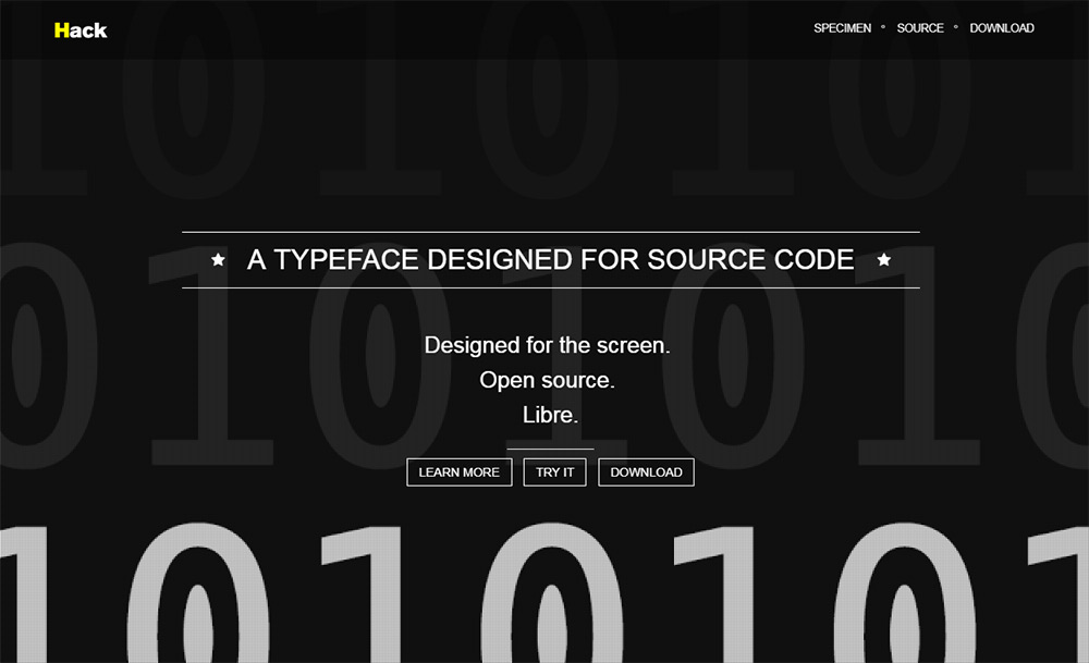
One of the few listings that I didn’t track down through Google Fonts, Hack is a true programmer’s font family.
This is a typeface truly designed for code and can be used on any platform – web, mobile or in your desktop IDE.
You can grab a copy from the main GitHub repo, along with further details regarding the font’s development. The font is multilingual, with support for over 1,500 glyphs (and counting!)
This one is well worth testing, even if you only use Hack for a few projects.

Gohufont

gohufont typeface
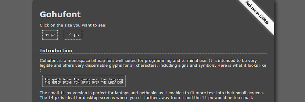
The Gohufont typeface is an excellent pick for that “classic” monospaced look. This reminds me more of the old school Nintendo fonts or the typefaces you’d see within old Gameboy games.
If you look over the main page, you’ll find examples with an auto-resizer. You can test the font at 11px or 14px to compare the differences. This includes all-caps and lowercase letters, along with special symbols.
I actually don’t like this much for an IDE, but it can work well on a website. Or, you might also try using this in your terminal window. Gohufont works really well as a CLI typeface since it matches perfectly to all programs.

Source Code Pro

source code pro typeface
This is perhaps the most famous monospaced font in Google’s entire library. Source Code Pro comes in a bunch of different styles, ranging from super thin to ultra bold.
You can restyle this font family to suit your needs and to match your site’s code tags. If you have any syntax highlighting plugins, this font will work flawlessly.
Note that Source Code Pro was designed as a companion piece to the original Open Sans font. So it works really well on websites that use Open Sans or any of its variations.

Overpass Mono

overpass mono font
I’ve tested the Overpass Mono in my code editor and it works really well. Granted, I’ve never tried using it in a website layout. But I imagine it can work just as well for that, too.
Overpass Mono is an excellent choice, in that it has a variety of styles without veering too far away from a traditional monospace font. It looks just like any other monospace typeface, except it really has its own “feeling” that grows on you over time.
Give it a shot on your website or try it side-by-side in two different IDE windows. You may find that you like this even more than your default font.

Oxygen Mono

oxygen mono
With the Oxygen Mono typeface, you get a design very similar to Overpass. The biggest difference is the lack of stylization and fewer formatting options.
This font only comes in one format: normal. You can still bold or italicize the font, but it will be rendered through CSS – rather than through a font file. I recommend this for the web because it’s smaller and easier to blend with different color schemes.
Not to mention it can work just as well alongside any font stack you choose.

Anonymous Pro

anonymous pro font
I’ve saved the most unique font choice for last with Anonymous Pro. This is a pretty darn creative typeface and it’s one of the easiest fonts to recognize.
One minor complaint I have is the lack of “crispness” of the letters at smaller sizes. You can still recognize the letters and it works fantastic as a code font. But it’ll stand out from all the others in this list, especially anywhere below 12px.
On the plus side, this font straddles the line between monospaced, serif and sans-serif. It borrows ideas from all of them, so you can get this to fit in anywhere on your site.